Cincinnati & Hamilton County Public Library: Cincinnati Enquirer Photo Archive Project
Problem Statement: In 2022, the Cincinnati and Hamilton County Public Library was contacted by the city's largest newspaper publication, the Cincinnati Enquirer. The Enquirer was leaving their office building and looking to downsize, and offered CHPL their complete photo archive of over 2 million photos, slides, and clippings spanning 1945-1995. My department, the Genealogy and Research Services Department, accepted the archive then rehoused the collection and inventoried thousands of folders in an effort to process the collection to make it available for public access. Our overarching goal is to digitize the entire collection over time and make it available on our Digital Library, but until that point, we needed a system in which patrons could request images from the archive and receive them digitally. I was tasked with creating a landing page to share information about the archive with the public, as well as develop a workflow for patrons to make requests for images. However, due to the enormity of the collection, the limited staff time, the imperfect organization system of the collection, the uncertainty about how many requests we will receive at one time when it becomes available, and other factors, we had to take in many parameters into account.
Research: Much of our background research was built on our past experiences of performing reference services in our department, which helped us determine how much staff time we could devote to each request, how long it would take to scan a certain number of photos, whether a whole folder should be scanned at once or just a few images at a time, how long it would take for images to be published on the Digital Library, and other components. I met with a smaller team within my department: our Department Manager, our Digital Services Manager, and our Reference Services Coordinator. We met several times to outline the different steps of the process and determine pain points. We decided that we would develop a request form for both customers and librarians to use to initiate image requests. Then we would create a spreadsheet that logged the request as it moved through the different steps and different teams within our department from consultation to scanning to delivery.
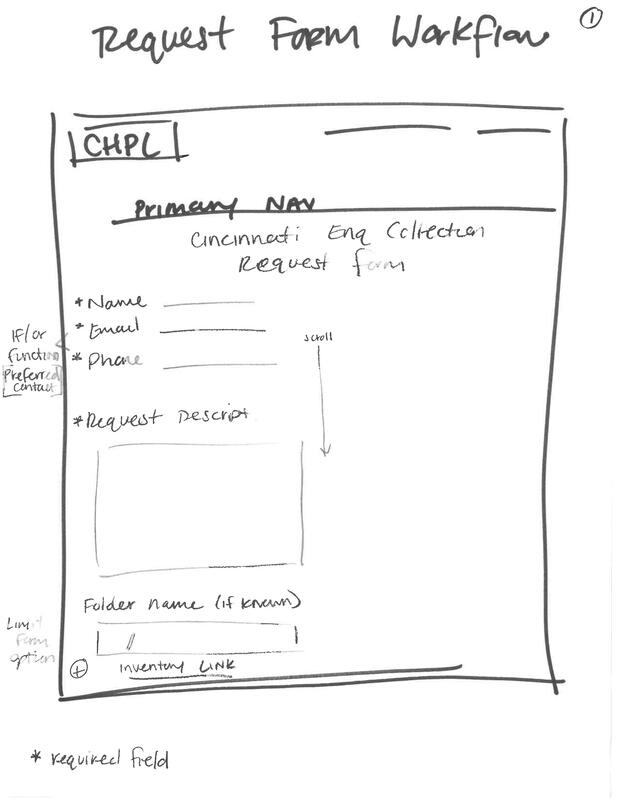
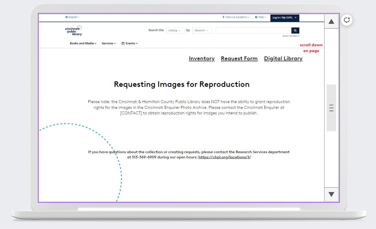
Low-Fi Design & Feedback: Based on our meetings, I developed two initial low-fidelity wireframes: a wireframe for the landing page with information about the collection that will live on CHPL's public website that contains links to various parts of the archive, and a wireframe for the request form that librarians and patrons will both use to make image requests.
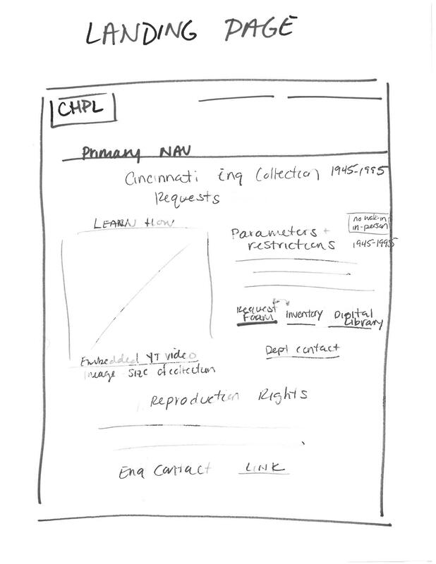
|
|
After more discussion and feedback with the entire team, we altered small portions and details of each wireframe. We also developed the spreadsheet that we would use to log requests, which helped inform the front end of the design.
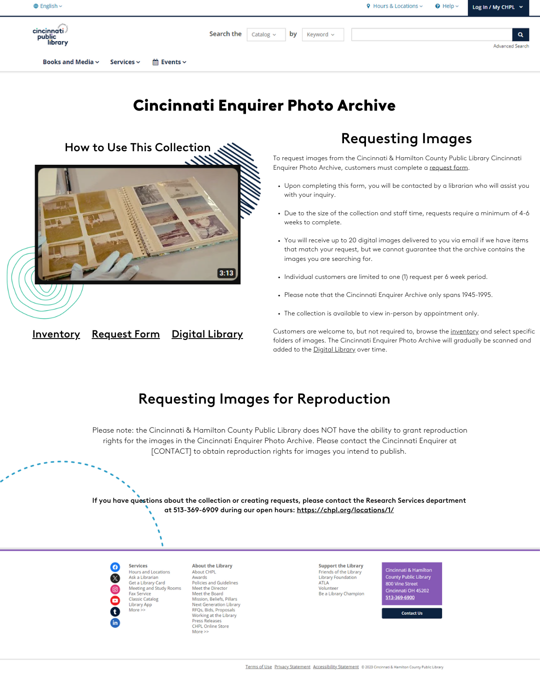
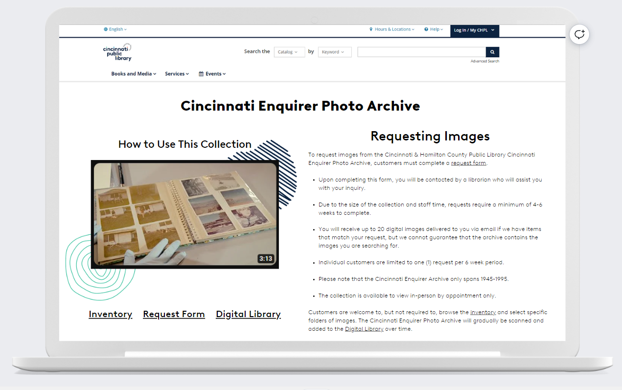
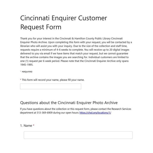
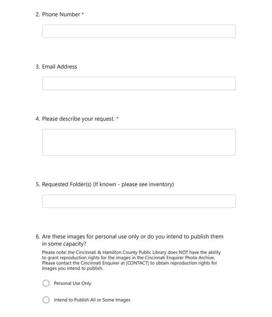
Hi-Fi Design: With this feedback, I created a high-fidelity wireframe and prototype. I created the landing page as it would appear on our website with the appropriate links and branding. I also created a form using Microsoft Forms.
|
|
|
|
Results & Outcomes: We have just submitted these final designs to CHPL's Senior Leadership Team where they will approved and implemented by our Marketing and IT Departments. We have decided to give customers access to our inventory list in an effort to maximize access and transparency. Once the pages are created and requests can be made by the public, we will continue to test the designs and ensure that they suit our department's needs and the volume of requests. We as a team have agreed to work iteratively and alter these designs if necessary.
Lessons Learned: One major takeaway from this experience was that there are many situations that you simply can't plan for as a designer. I was fortunate to have a manager and team that went into this with the understanding that we needed a design to get us started, but it may not be what we have six months or a year from now. Because we have no idea if we'll receive five requests or five hundred requests and because the collection is incomprehensibly big, there were just too many unknowns about the project. Creating a framework with the intention of iterating as we go helped me focus on the true purpose of the deliverables and not stress about trying to capture every single little detail in the design.
Papa Johns Website User Experience Evaluation (UXD 60104 - Usability I)
Problem Statement: Papa John's is the fourth largest pizza restaurant chain in the U.S. and is the world's third largest pizza delivery company. Like many pizza restaurant chains, Papa John's customers can utilize the Papa John's website www.PapaJohns.com to place orders for delivery or pick up in their location, sign up for coupons and deals, give feedback to the company about their ordering experience, and other tasks. In this class, students conducted a study to evaluate the overall user experience of the Papa John's website, and more specifically, the principles of usability, including learnability, efficiency, memorability, user satisfaction, consistency, and accessibility.
User Research & Interviews: To assess these principles, 26 moderators conducted real-time, moderated, video-recorded usability interviews of the Papa John's website with 26 participants over the age of 18 who were each given a set of ice breaker questions and three defined tasks to complete. A final report analyzed four moderated sessions (four videos) with three other classmates and examined the verbal responses, user actions and pathways, facial expressions, and body language of the participants to evaluate user experiences of the website and develop recommendations and follow-up research questions. This study was conducted to identify issues and offer suggestions to improve the experience of the site, not only for the customer, but to improve sales, reputation, and customer retention for the company. Below are the videos of the usability interview I conducted.
|
|
|
Screener Questions and Additional Tasks: After the interviews were conducted, my group redrafted our screener questions and developed additional tasks for future interviews.
|
|
|
Analysis and Conclusions: I created a final report to discuss the findings from analyzing all four videos (mine plus my classmates' interviews) that included an executive summary, our methodology, participant information, the pre-task questions and list of tasks, a synopsis of the findings, an analysis of the tasks, and follow up research questions. Some themes that emerged from the interviews were that participants were able to complete their pizza orders, but with some challenges. Some participants were not able to complete certain tasks. Participants were annoyed or confused by the constant pop-up menus. Participants were confused by the lack of feedback or confirmation from the system when an item was added to the cart. All four participants were displeased about being required to give their phone numbers for text messages when they just wanted to sign up for the email list. I gave some brief recommendations that the website should give clearer feedback when items are added to the cart and should decrease the number of times pop up menus are displayed. Download the final report below.
Further research: After analyzing the usability interviews, tasks, and screener questions, I identified some areas for future research to determine more concrete areas where the site could improve. I developed several research questions that could be explored to suggest further improvements to Papa John's website.
- What is the optimal frequency of displaying pop-up menus and on what pages to increase sales but not deter customers?
- What is the best way to show confirmation or feedback that an item has been added to a customer's cart?
- How can customers be motivated to sign up for email rewards or even to create an account? How can customers be reassured that they won't receive excessive spam emails?
- How can the menu interface be improved to encourage users to see all options before ordering? How can the menu interface be improved to show users the differences between custom pizzas, default pizzas, and specialty pizzas?
Lessons Learned: From this project, I learned the enormous value of user testing. There is truly no substitute for sitting down with participants and spending the time to gather their feedback, thoughts, emotions, and actions. I also learned that it is better to process the information from these interviews in phases. Conducting the initial interview with good moderator practices and not taking notes so that you can devote your time and attention to them, then rewatching the interview and taking notes, then analyzing the interviews with or without the discussion from colleagues was a time-consuming but extremely rewarding process that I believe I will definitely use in my future career.
ReminderX App Development and Status Updates (UXD 60020 - UXD in Practice)
Problem Statement: Students were tasked with developing a mobile application called ReminderX, a reminder and scheduling app to manage various personal and business appointments, tasks, and events. This multi-stage project required us to create a user persona, develop and use a Research Protocol with a framework of questions to ask each participant about their digital and analog scheduling and reminder habits, recruit and interview participants about their scheduling and reminder habits, compile data, and draft wireframes of the application with different workflows and features. We also composed email status updates to update our fictional supervisor about our progress throughout the project.
Research Protocol: We developed a Research Protocol with a framework of questions to ask each participant about their digital and analog scheduling and reminder habits, their scheduling and reminder smartphone application usage, and what changes, features, or improvements of these applications would suit their lifestyles. They were given the opportunity to reflect on features they liked and disliked about their current applications and systems.
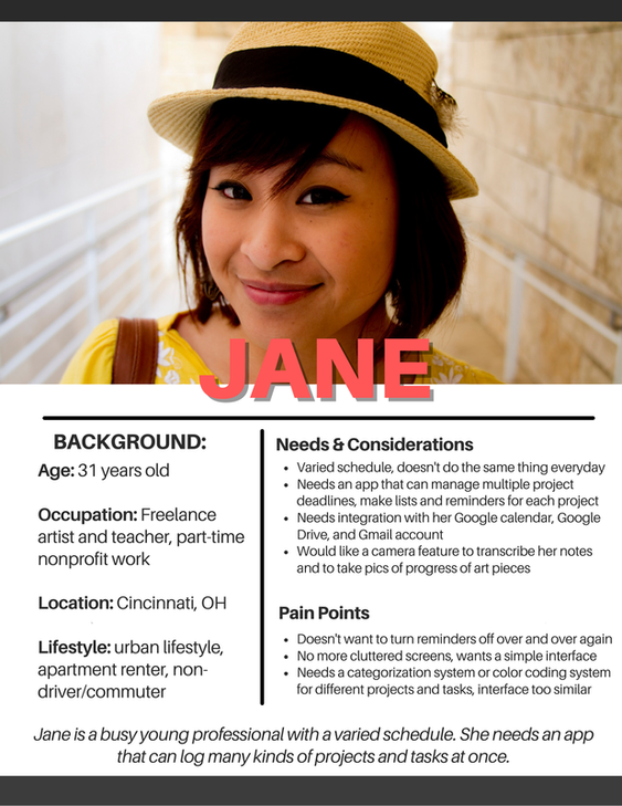
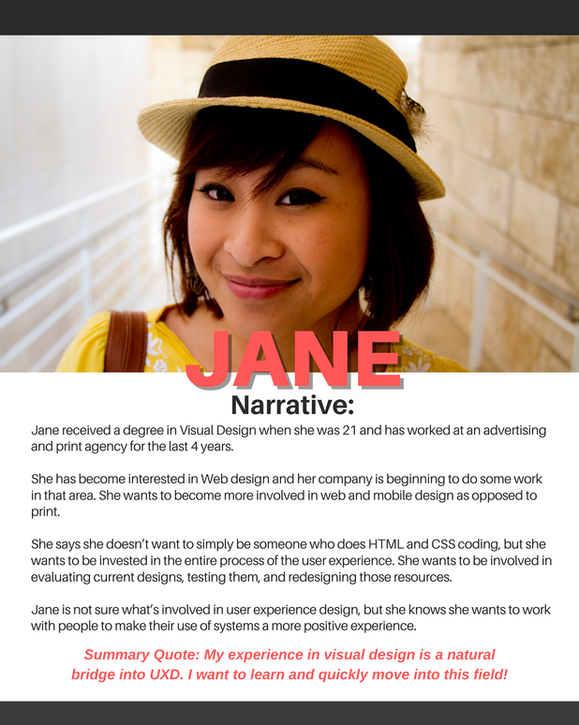
Research Persona: We developed user personas to identify possible users of ReminderX and understand what their needs might be. Each user of ReminderX has a different schedule, different lifestyle, unique preferences and challenges, and should have the option to tailor the app to suit their needs. Users include parents with multiple schedules to track, college students with changing schedules, nonprofit and business leaders with many lists and projects, and more.
|
|
User Interviews: Once the Research Protocol was finalized, I recruited four participants: Anna, Cloud, Missy, and Sam, (in a real world setting, I would recruit many more participants) to conduct and record 8 to 10-minute qualitative interviews (in a real world setting, I would conduct longer qualitative interviews). All the participants interviewed used multiple scheduling apps on their phone to log different tasks and reminders, including an alarms app, a notes app, a calendar app, and more. See two participant interview videos below.
|
|
|
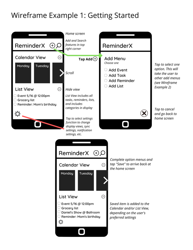
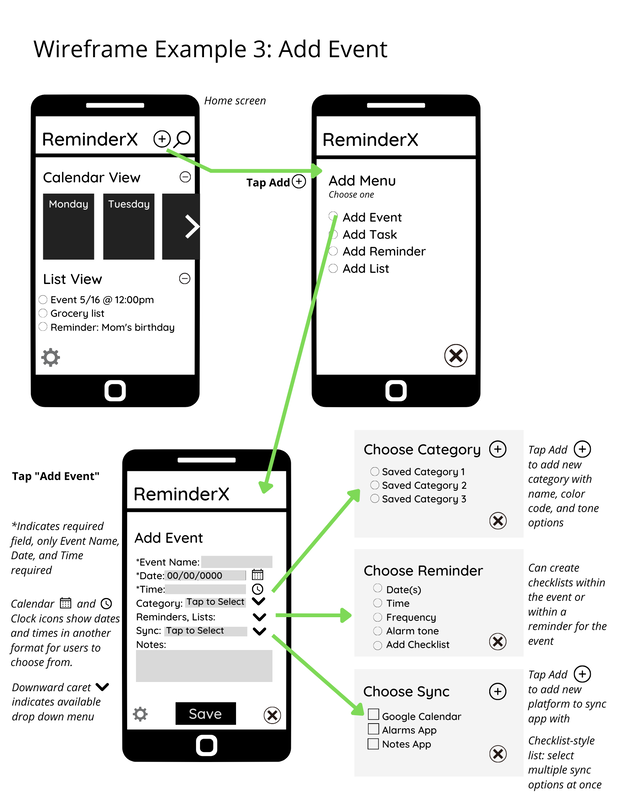
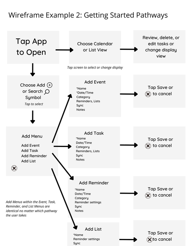
Wireframes: Using the insights that participants gave in their interviews, I created wireframes of four different workflows of the mobile application: Getting Started (which included different pathways depending on the action the user wants to start with), Add Event, Add Reminder, and Add Task.
|

|
Design Critique and Status Updates: After the interviews and wireframes were completed, I wrote a Design Critique document to outline the high-level designs of the application and the workflows visualized in the wireframes. I also outlined three design tenets that emerged from participants' feedback and how they were implemented in the design: Universality, Cleanliness of Design, and Usefulness. Finally, I composed short email status updates throughout the project to update my hypothetical supervisors, Jorge and Vera, about the progress of the project. The final status update is show below that summarizes all the work completed over the course of the project.
|
|
|
Lessons Learned: This project was extremely beneficial for learning about the lifecycle of developing a product, gathering insights about user experience from real people, using their suggestions, and how to develop each step to build each design phase. It was also a great exercise in practicing the real world skills of updating an employer or supervisor on the progress of my work. Seeing this project take shape over several weeks was very satisfying and gave me insights on how long different steps of design development actually take. Though this project was simplified, it was a useful comparison to real-life projects.
10-Foot Interface Design & Prototyping (UXD 60102 - Principles of Interaction)
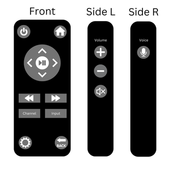
Problem Statement: Students were instructed to design an interface for a movie streaming application, an interface that is intended to be used at least 10-feet away. Additionally, students were asked to design a corresponding remote control that would optimize the viewer's experience and navigation of the application.
Wireframes: I drafted wireframes of the main homepage of the application, as well as for a landing page of an individual movie/media title. Both pages included the name or title of the media, the category name, the year the movie was released, the movie run time or television episode count, and viewer ratings. The media title page also includes a summary, recommended titles, and the director, cast, and crew so that users can see more titles related to those people.
|
|
|
Prototype Demonstration: Once the wireframes of the interface and the remote were drafted, I created a low-fidelity prototype of the remote control. I then recorded a short demonstration of how the remote and interface would operate together.
|
|
Lessons Learned: This assignment was instrumental in helping me understand the different components of a single design, both in the digital and physical world, and how they function together. It was great practice for understanding and designing a real-world product, and it was a valuable opportunity to create and demonstrate my first physical prototype.
Miscellaneous Projects
Interactive Form Design: Wireframes for an interactive form for adults to sign up for a "Meals on Wheels" style service.
| interactiveformdesignwireframe_clarityamrein__2_.pdf |
Card Sorting Exercise: Tested three participants using a card sorting exercise to identify the most appropriate menu organization for a contractor website.
| card_sorting_exercise_clarityamrein__1_.pdf |
